By Norman R.
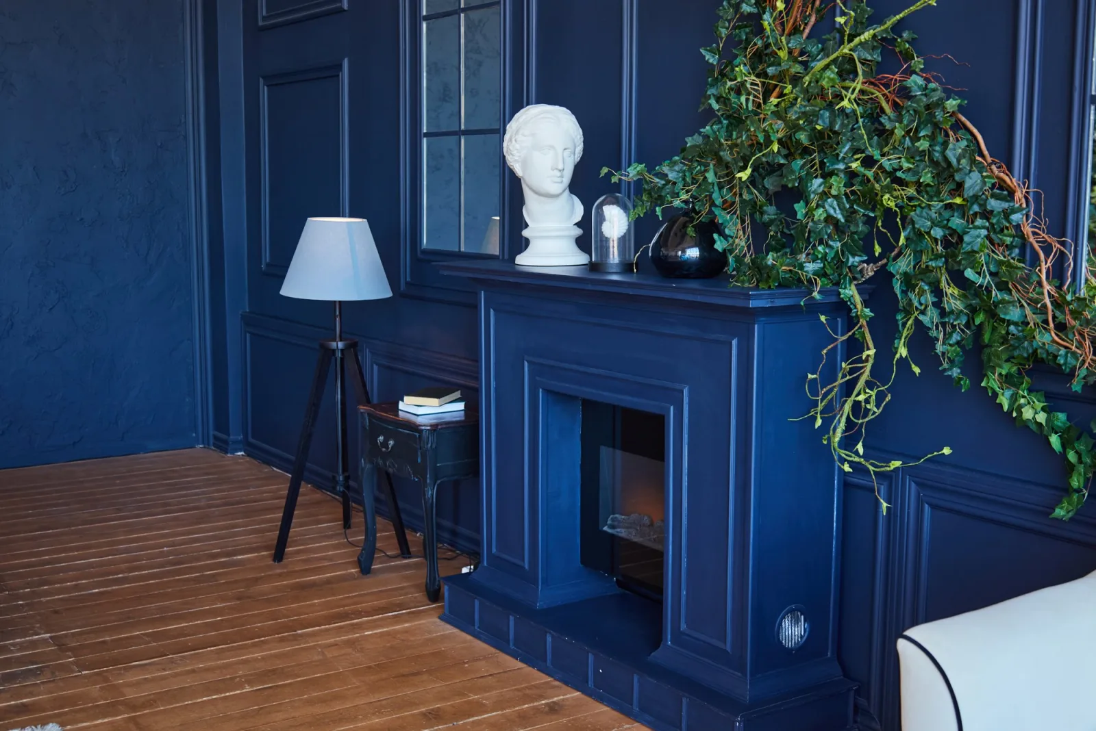
The best living room paint colors for 2026 are a three-color Sherwin-Williams palette: Agreeable Gray (SW 7029) on the walls, Pure White (SW 7005) on the trim, ceilings, or built-ins, and Naval (SW 6244) on an accent wall or fireplace feature. Agreeable Gray is a soft gray with beige undertones that grounds the room without feeling cold. Pure White is bright and clean, and it pairs naturally with Agreeable Gray. Naval adds rich, designer contrast without overwhelming the space.
Choosing a living room palette is harder than choosing a single color. The walls, trim, ceiling, and focal point all need to work together under daylight, lamplight, and evening shadows. The most common mistake is picking each color in isolation from a small chip, then discovering the undertones clash once everything is on the wall.
Regional light conditions, seasonal humidity, and local architecture heavily influence how this palette reads in a finished room. In humid Southern coastal climates, strong sunlight and warm reflected light from outdoor greenery can push Agreeable Gray toward its beige side, so Pure White trim keeps the room feeling fresh. In high-altitude Western regions with arid air and intense, cool daylight, Agreeable Gray can lean slightly grayer, and Naval reads deep and saturated. In Northern homes facing long winters and freeze-thaw seasons, the warm beige undertone in Agreeable Gray offsets cool northern light, while a Naval fireplace wall adds a cozy, anchored feel. Below is a complete color palette guide for using Agreeable Gray, Pure White, and Naval in your living room.
Quick Reference Summary for the 2026 Living Room Palette
- Wall Color: Sherwin-Williams Agreeable Gray (SW 7029), a soft gray with beige undertones that grounds the room.
- Trim, Ceiling, and Built-In Color: Sherwin-Williams Pure White (SW 7005), a bright, clean white that pairs nicely with Agreeable Gray.
- Accent Color: Sherwin-Williams Naval (SW 6244) on one accent wall or a fireplace feature for designer contrast.
- Recommended Sheens: Eggshell or matte on walls, semi-gloss on trim, flat on ceilings, and satin or semi-gloss on built-ins.
- Testing Rule: Sample all three colors side by side on large swatches and view them in morning, afternoon, and evening light.
Why Does This Living Room Paint Palette Work?
This palette works because it follows a simple and proven design structure: one main neutral, one clean white, and one deep accent. Each color has a defined job, so the room feels intentional instead of busy. The neutral carries most of the wall area, the white frames it, and the accent gives the eye a place to land.
Agreeable Gray belongs to the greige family, a blend of gray and beige. That balance is why it adapts to so many living rooms. It does not read sterile like a cool gray, and it does not read yellow like an older tan. It works with wood floors, leather seating, linen upholstery, and both warm and cool metal finishes.
Pure White completes the frame. A white that is too stark can make greige walls look muddy, while a white that is too creamy can look dingy next to gray. Pure White sits in a balanced middle ground, which is why it pairs so cleanly with Agreeable Gray.
Naval supplies the contrast. Deep navy reads sophisticated and calm rather than loud, so it can cover a full fireplace wall without overpowering the room. Against Agreeable Gray and Pure White, it creates the layered, designer look many homeowners want in 2026. For more ideas on placing deep colors, see our guide on ideas for accent walls.
“Pro Tip 1: Use the 60-30-10 Rule as a Starting Point. Many designers start with roughly 60 percent main color, 30 percent secondary color, and 10 percent accent. In this palette, Agreeable Gray covers most of the walls, Pure White handles trim, ceilings, and built-ins, and Naval stays on one feature. Keeping Naval to a single wall or fireplace prevents the room from feeling closed in.”
Color details for Agreeable Gray, Pure White, and Naval, including Light Reflectance Value (LRV), are listed on the Sherwin-Williams website, which makes it easier to compare how light or deep each color will look.
What Role Does Each Color Play in the Room?
Each color in this palette has a specific surface assignment. Following these placements keeps the scheme balanced.
- Agreeable Gray (SW 7029) on the Main Walls: Agreeable Gray covers the largest surface area, so it sets the mood for the whole room. Its beige undertone keeps the space warm and grounded. Because it is a mid-light neutral, it also flows easily into adjoining hallways, dining rooms, and open-concept kitchens. If you want one consistent color across connected spaces, read our guide on paint colors for a cohesive home.
- Pure White (SW 7005) on Trim, Ceilings, or Built-Ins: Pure White outlines baseboards, door casings, window trim, and crown molding. On the ceiling, it bounces light back into the room and keeps the space feeling open. On built-in shelving or bookcases, it creates a crisp, finished look that frames books and décor. Using one white across all trim and ceilings keeps the palette clean and simple.
- Naval (SW 6244) on an Accent Wall or Fireplace Feature: Naval works best on a natural focal point. A fireplace surround, a chimney breast, or the wall behind the main sofa are ideal. Avoid placing it on a wall broken up by several doors or windows, since the contrast will chop the wall into pieces. A solid, uninterrupted plane lets Naval read rich and deliberate.
How Should You Test and Sample These Colors Before Painting?
Testing matters because paint color shifts with light direction, time of day, and surrounding finishes. A color that looks perfect on a chip can read very differently on a full wall. Follow these steps before committing.
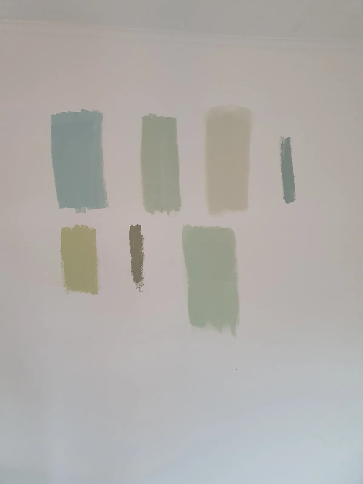
- Use Large Samples: Paint sample boards at least 12 by 12 inches, or larger if possible. Small chips exaggerate or hide undertones.
- Test All Three Together: Place Agreeable Gray, Pure White, and Naval samples next to each other. The palette is designed to work as a set, so judge it as a set.
- Check Multiple Walls: Move the Agreeable Gray board to a sunny wall and a shaded wall. North-facing rooms tend to cool colors down, while south-facing rooms warm them up.
- View at Different Times: Look at the samples in the morning, mid-afternoon, and at night under your lamps. Warm bulbs will pull out more beige in Agreeable Gray.
- Compare Against Fixed Finishes: Hold samples next to flooring, stone, brick, and large furniture pieces that will stay in the room.
Which Sheen Should You Use on Each Surface?
Sheen affects how the colors look and how well they hold up. A consistent sheen plan keeps the palette polished.
Walls painted in Agreeable Gray usually look best in eggshell or matte. Eggshell offers a soft glow and better washability, which helps in family rooms with kids or pets. Matte hides wall imperfections well and gives a velvety, modern look.
Trim in Pure White typically gets semi-gloss. It resists scuffs from vacuums and shoes and wipes clean easily. Ceilings in Pure White are traditionally flat, since a low sheen hides roller marks and minor surface flaws overhead.
Naval deserves extra thought. Deep colors show touch-up marks and burnishing more easily than light colors. Matte gives Naval its richest, most saturated look, while eggshell adds durability on a fireplace wall that gets frequent contact. Built-ins in Pure White perform best in a satin or semi-gloss enamel that resists sticking and wear. Learn more in our guide on the best paint finish for each room in your home.
The U.S. Environmental Protection Agency (EPA) notes that paints can release volatile organic compounds (VOCs) indoors, so choosing low-VOC products and ventilating well is smart in living spaces your family uses every day.
What Are the Most Common Mistakes With This Palette?
Avoiding these errors keeps the palette looking intentional and professional.
- Using Too Much Naval: Painting two or three walls in Naval can make a living room feel small and dark. Keep it on one feature.
- Mixing Multiple Whites: Pairing Pure White trim with a different ceiling white creates subtle mismatches that read as mistakes. Use one white throughout.
- Skipping Primer Under Deep Colors: Naval may need extra coats over a light base, or over patched areas. A tinted primer often helps deep colors reach full, even coverage in fewer coats.
- Ignoring Wall Prep: Nail holes, dents, and cracks show more clearly once fresh paint goes on. Patch and sand before painting.
- Judging Color at Night Only: Artificial light shifts undertones. Always confirm colors in daylight as well.
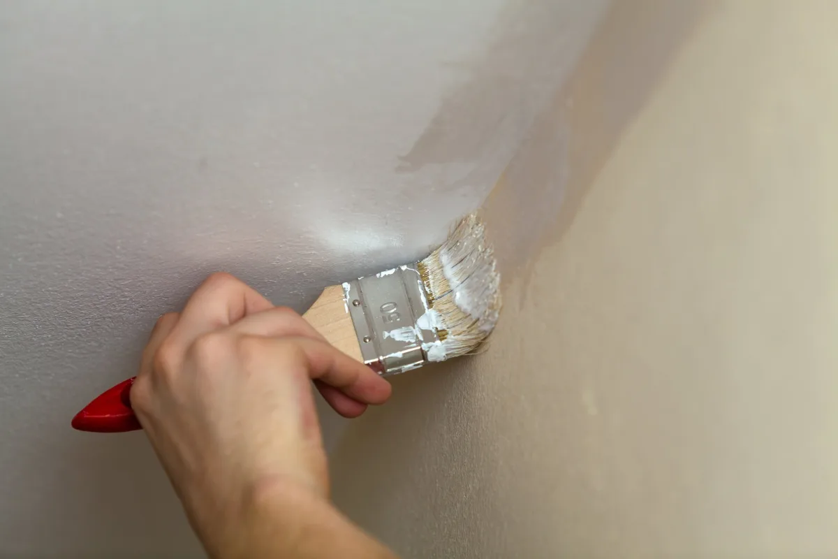
“Pro Tip 2: Cut Deep Accent Colors Cleanly Against Light Walls. Deep colors like Naval show every wobble where they meet a light wall. Paint the Agreeable Gray walls first, let them dry fully, then tape the corner and cut in Naval. Pull the tape while the final coat is still slightly wet for a crisp, clean line.”
If your walls need repairs before painting, our drywall repair team can patch dents, cracks, and nail pops so the new colors go on smoothly.
Answers to Common Questions About Living Room Paint Colors for 2026
Is Agreeable Gray gray or beige?
Agreeable Gray is a soft gray with beige undertones, which places it in the greige family. In warm light, it leans more beige. In cooler light, its gray side becomes more noticeable.
What white trim goes with Agreeable Gray?
Pure White (SW 7005) is an excellent trim and ceiling match for Agreeable Gray. It is bright and clean without feeling harsh, so it frames the greige walls crisply.
Where should I use Naval in a living room?
Use Naval on one accent wall or on a fireplace feature. A solid wall behind the sofa or a chimney breast works best. This adds rich contrast without overwhelming the room.
Will Naval make my living room look smaller?
Not when you limit it to a single feature. Surrounded by Agreeable Gray walls and Pure White trim, a Naval wall adds depth and focus. Problems arise only when deep color covers most of the room.
Can I use this palette in an open-concept home?
Yes. Agreeable Gray flows well into kitchens, dining rooms, and hallways. Keep Pure White on all trim for consistency, and reserve Naval for the living room's focal point.
Paint manufacturers, including Sherwin-Williams, offer large peel-and-stick color samples because screens and printed chips cannot fully reproduce how a color reads on a wall.
Ready for Professional Interior Painting?
Choosing a balanced palette, prepping walls, cutting crisp lines, and applying deep accent colors evenly takes skill and the right tools. Let our experienced interior painting teams bring Agreeable Gray, Pure White, and Naval to life in your living room.
Note: Pricing estimates are based on 2026 regional averages. Every home is unique, and final quotes require an on-site assessment to account for material costs, prep work, and structural conditions.
Contact the team at That 1 Painter today to schedule your detailed, obligation-free on-site estimate, and give your living room a polished, designer-ready finish. Book Your Free Professional Estimate Now
