The Ultimate Guide to Matching Paint Colors with Furniture
That 1 Painter is the fastest-growing painting company in the world. Painting your space can be complicated, but with our expertise, we make the process easy and stress-free for homeowners. With franchises across the nation, we have helped tens of thousands of homeowners make the best choices for their homes without sacrificing quality, and we are here to show you how.
The Ultimate Guide to Matching Paint Colors with Furniture
You can have nice furniture, trendy decor, and a fresh coat of paint, but something still feels off if the colors don’t work together. As local painters in North Minneapolis, we’ve seen how clashing tones can throw off a whole room, no matter how great the design is.
Matching your paint with your furniture isn’t just about looks. It helps the space feel more connected, comfortable, and sometimes even bigger.
That’s what we’re here for at That 1 Painter. We help homeowners pull everything together so your space feels right the moment you walk in.
How to Match Paint Color to Furniture: A Step-by-Step Guide
Many homeowners find color matching tricky during interior painting projects. At That 1 Painter, we simplify the process. Here’s how to do it:
Step 1: Identify the Dominant Tones in Your Furniture
Start with your biggest furniture pieces—like sofas, dining tables, or bed frames. Are the colors warm (reds, yellows, golds) or cool (blues, grays, blacks)? Even neutral items have subtle undertones. Spotting these is the first step to picking a color that works with, not against, your furniture.
Step 2: Choose a Mood or Style
What vibe do you want your room to have? Do you want it cozy and inviting or modern and fresh? Warm tones with similar hues create a comfortable feel, while cool tones give a clean, sharp look.
Step 3: Compare Paint Swatches with Your Furniture
Head to the paint store—or ask That 1 Painter for a color consultation—and grab swatches that match your furniture’s tones. Hold them up to wood finishes, upholstery, and accent pieces. Check them out at different times of the day to see how light changes the color.
Step 4: Test a Few Samples on the Wall
Once you’ve picked a few colors, paint samples on the wall. Don’t skip this! What looks good on a swatch might look different in your space. Make sure you paint at least a 12” x 12” patch and let it dry before deciding.
Step 5: Take a Step Back and See the Big Picture
Now, step back and look at the room. Do the colors feel balanced? Are there any visual distractions or clashing tones? If everything flows, you’re on the right track.
Step 6: Ask for Expert Help
If you need extra guidance, That 1 Painter is here to help. We offer interior painting services and color consultations in North Minneapolis. We’ve helped many homeowners find the perfect paint color, and we’d love to help you, too.
If you’re working with cabinetry or trim, you’ll want to explore the best paint for cabinets and doors to get a durable professional-looking finish that ties in beautifully with your furniture palette.
Choosing the Right Paint Finish for Your Furniture Style
Once you’ve picked your color, the paint finish is just as important. As interior painting experts in Minneapolis, we help homeowners choose the best finish to match your furniture and lifestyle.
Rustic Furniture: Go with Matte or Eggshell
If you have rustic wood or textured furniture, matte or eggshell finishes are the way to go. These finishes soak up light and give your room a laid-back, natural feel.
Modern Furniture: Satin or Semi-Gloss
Modern furniture often has sleek lines and smooth surfaces. Satin or semi-gloss finishes work together here, as they reflect light and add a subtle shine. Plus, these finishes are perfect for high-traffic areas where durability counts.
Vintage Furniture: Low-Sheen Finishes
Flat or eggshell finishes help tone things down and reduce glare. They’re an excellent match for older or traditional pieces of furniture.
Eclectic Furniture: Mix Finishes Intentionally
Eggshell is a great wall color option for mixed styles like industrial and mid-century. Satin or semi-gloss can be used on accent walls to highlight unique pieces and add some flair.
That 1 Painter helps homeowners across the Twin Cities choose the perfect finish for their interiors. With our painting services in North Minneapolis, you’ll get expert recommendations and flawless execution—whether your home is modern, rustic, or somewhere in between.
Click here to learn about cabinet paint and the best options for trim and doors so you can choose the right type of paint that complements your furniture while lasting longer.
The Role of Undertones: Warm vs. Cool Furniture and Paint Pairings

If a paint color looks different at home than it did in the store, undertones are likely the cause.
What are Undertones?
Undertones are the hidden tints that influence how a color is perceived. For example, gray paint may lean blue (cool) or brown (warm). These subtle differences become more noticeable next to other items like furniture.
How to Spot Undertones
- Warm undertones in furniture typically show hints of red, orange, yellow, or golden tones. You’ll often find these in wood finishes like cherry, mahogany, or oak with golden hues.
- Cool undertones lean toward blues, grays, greens, or even some blacks. Think metal frames, gray upholstery, or ash-toned wood.
Pairing Undertones for Harmony
To keep things feeling balanced, try pairing warm tones with warm ones and cool tones with cool ones. For example, beige walls with yellow undertones go nicely with honey-colored wood. In contrast, gray walls with blue undertones work well with navy or charcoal furniture.
Pairing Undertones for Contrast
If you prefer contrast, intentionally mix warm and cool tones. A warm leather couch can stand out against a cool slate gray wall, creating visual interest and depth. Just keep one tone dominant to maintain cohesion.
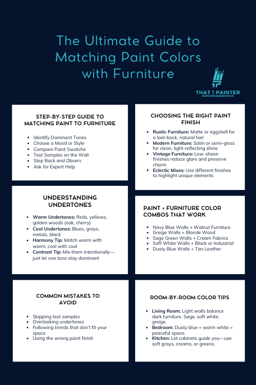
Popular Paint Color Combos That Work Together with Different Furniture Tones
Here are some tried-and-true combos inspired by the latest interior trends in North Minneapolis:
- Navy Blue Walls + Walnut or Dark Wood Furniture
Navy and dark wood create a rich, cozy vibe. The deep navy brings out the warm tones in walnut or other dark woods, making it perfect for dining rooms or home offices.
- Greige Walls + Light Oak or Blonde Wood
Greige (a mix of gray and beige) is super versatile. It adds warmth without overpowering a space and pairs beautifully with oak or blonde-toned wood for a soft, natural look. It’s an excellent choice for open-concept spaces or living rooms.
- Sage Green Walls + Neutral or Cream Fabrics
Sage green gives your room a calm, organic feel. It pairs nicely with cream sofas or light neutral accents, adding just the right pop of color without taking over the space.
- Soft White Walls + Black or Industrial Furniture
If you want something modern and clean, go for soft white walls with bold black or industrial furniture. This high-contrast combo feels crisp, current, and effortlessly stylish.
- Dusty Blue Walls + Tan Leather
Dusty blue is perfect for creating a cozy, rustic feel. It works beautifully with tan leather furniture, highlighting the warm caramel tones. It’s great in bedrooms or reading nooks for a relaxed, inviting vibe.
Mistakes to Avoid When Matching Paint Colors and Furniture
As one of the best professional painters in North Minneapolis, Minnesota, we’ve helped many homeowners avoid these common pitfalls. Keep these interior painting tips in mind:
- Skipping Test Samples: Paint can look different in your space than on a swatch. Test it on the wall before making a final decision.
- Overlooking Undertones: Always compare undertones. Even two neutral colors can clash.
- Chasing Trends Without Considering Your Space: Trendy colors don’t always work in every home. Focus on what enhances your furnishings and lighting.
- Using the Wrong Finish: The wrong finish can ruin the effect even if the color is spot on. For example, using high-gloss paint in a cozy living room can reflect too much light and feel out of place. Choosing the right sheen for your space and furniture style is as important as color.
At That 1 Painter, we help you with every little detail—like undertones, finishes, and lighting—so you can avoid the hassle of repainting down the line. We’ve earned our spot as one of the top painters in North Minneapolis by helping homeowners make choices they’ll love for years.
Color Matching for Specific Rooms: Living Rooms, Bedrooms, and Kitchens
Different rooms call for different strategies. Here’s how we approach color matching as North Minneapolis interior painters:
Living Room: Anchor neutral sofas with greige, soft white, or sage green. For darker furniture, lighter walls add balance. Try navy or charcoal for accent walls if you want contrast.
Bedroom: Dusty blue, light gray, or muted green create a peaceful setting. Dark wood beds pair well with soft, warm white walls.
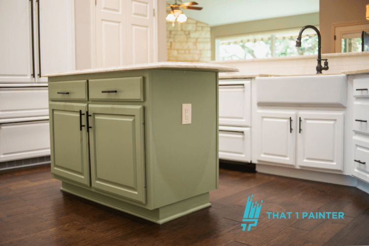
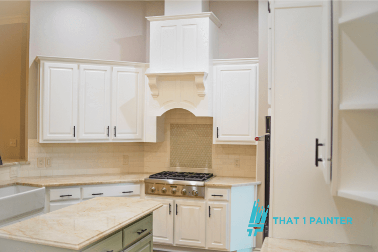
Kitchen: Let cabinetry and counters lead the way. Creamy whites, soft grays, or pale greens are great base tones. Cool-toned walls can modernize warm wood cabinets, and warm tones can soften sleek appliances.

How That 1 Painter Helps Homeowners Match the Perfect Paint with Their Furniture
Paint selection should feel straightforward. At That 1 Painter, we combine practical tools, professional insight, and a detailed approach to help you make confident choices.
Call That 1 Painter Northern Minneapolis at (763) 280-3736 to schedule your free estimate.