That 1 Painter is the fastest-growing painting company in the world. Painting your space can be complicated, but with our expertise, we make the process easy and stress-free for homeowners. With franchises across the nation, we have helped tens of thousands of homeowners make the best choices for their homes without sacrificing quality, and we are here to show you how.
🎨 The Psychology of Color: How Paint Affects Mood and Productivity in 2025
Have you ever stepped into a room and immediately felt energized, relaxed, or even a little uneasy—without knowing why? It wasn’t just the furniture or the layout. It was likely the color of the walls.
Colors are more than just decoration. They influence how we feel, think, and even perform. Studies from institutions like the University of Texas show that color directly impacts our mood, stress levels, and productivity. That means your choice of paint could be doing more than changing your space—it could be changing your day!
Here in Philadelphia, where we blend classic charm with modern living, the way we design our interiors matters. Whether you’re working from a South Philly row home or relaxing in a Center City loft, the psychology of color can help you make every room work better—for your mind and your mood.
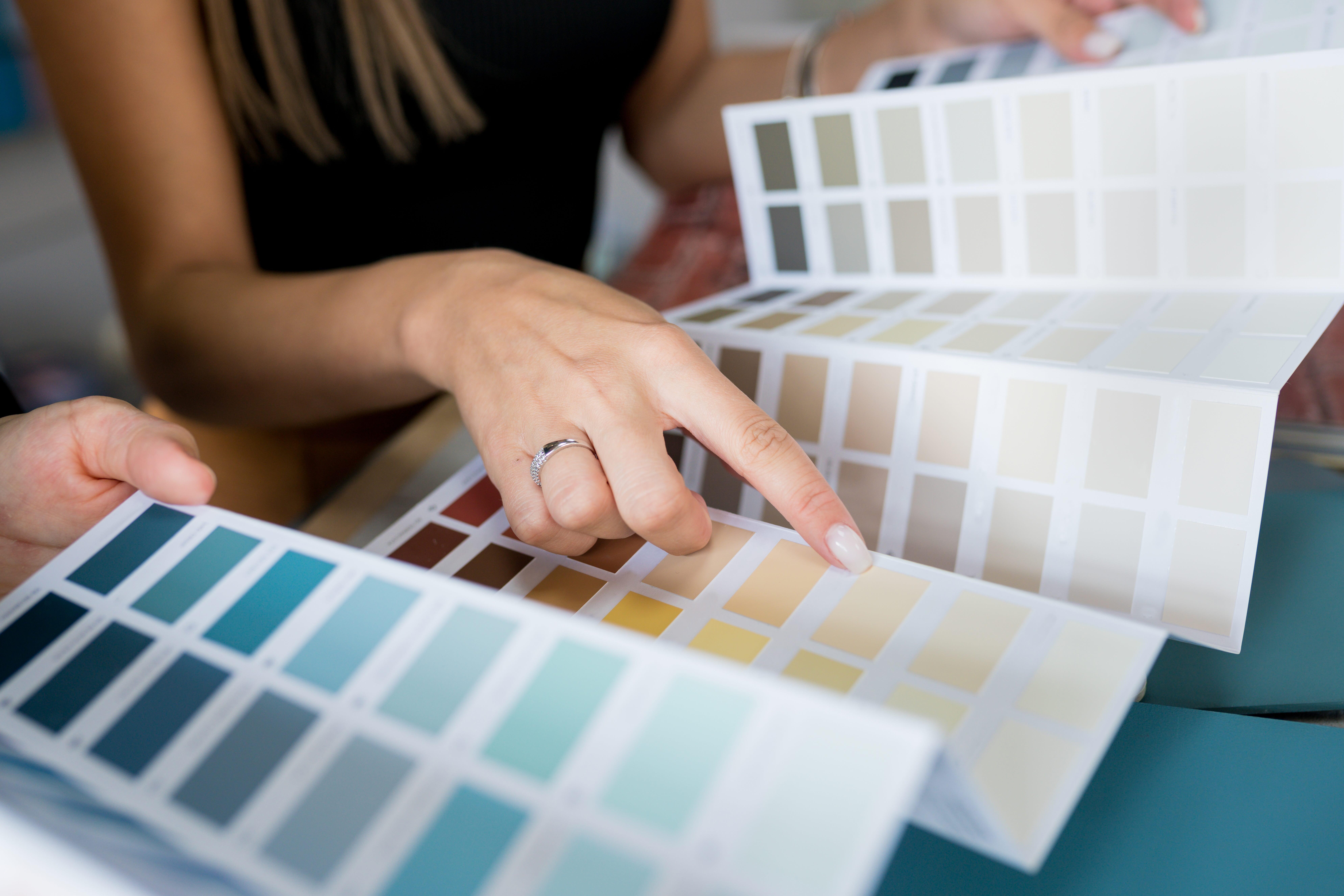
Let’s explore how smart paint choices can help you create spaces that feel as good as they look.
🧠 What Is Color Psychology and Why Does It Matter?
Color psychology is the study of how colors affect human emotions, behaviors, and perceptions. Sounds scientific? That’s because it is—but don’t worry, it’s also incredibly practical.
- Warm colors like red, orange, and yellow stimulate the senses. They’re exciting, energizing, and attention-grabbing.
- Cool colors like blue, green, and purple create a calming, peaceful atmosphere.
- Neutral tones—think gray, beige, and white—add balance and provide a clean, grounded feel.
Different colors trigger different responses in the brain. And while we all have personal associations with certain hues, science has proven some colors tend to evoke similar emotional responses in most people.
This is why businesses use color strategically—think of fast food restaurants with lots of red and yellow to stir up hunger and excitement. At home, you can use the same concepts to create spaces that help you focus, relax, or recharge.
🎯 How Paint Colors Influence Mood: The Emotional Power of Color
Color has a direct line to your emotions. It’s powerful, immediate, and can be either subtle or bold depending on how you use it.
- Blue is calming and dependable. It lowers heart rate and reduces stress. Perfect for bedrooms and bathrooms.
- Green is grounding and refreshing. It brings in a sense of balance and calm. Ideal for home offices and living rooms.
- Yellow is cheerful and energizing. It evokes sunshine and joy. Great for kitchens or small bathrooms.
- Red is bold and intense. It raises energy levels and even increases appetite! Use it in dining rooms or accent walls.
- Purple feels luxurious and imaginative. It sparks creativity. Wonderful for creative studios or kids’ rooms.
- Neutrals offer flexibility. They don’t push emotion as much but allow you to control the vibe with décor.
But be careful—too much of a strong color can backfire. A full red room may feel overwhelming. A dull gray one might make you feel unmotivated. The trick is balance.
In Philly homes—especially older ones with charming trim and molding—color can really shape the personality of a room while working with the architecture, not against it.
💼 Color and Productivity: Designing Workspaces That Inspire
With more Philadelphians working remotely than ever before, home office design has become a top priority. And guess what? Color plays a huge role in how productive you are during the workday.
- Blue tones have been shown to boost focus and reduce anxiety. Lighter blues for calm, deeper blues for sharp thinking.
- Green helps reduce eye strain (especially helpful if you stare at a screen all day). It also promotes steady, focused energy.
- Yellow, when used sparingly, can ignite creativity and optimism—great for brainstorming or problem-solving spaces.
Lighting matters too. Natural light changes how a color looks throughout the day. So test paint swatches on your walls and check them morning, afternoon, and evening.
Finish also plays a role. A satin or eggshell finish can reflect light gently, while matte finishes create a soft, cozy feel.
If you’re setting up a productivity hub in your Northern Liberties loft or a second bedroom in Fishtown, choosing a color that supports your workflow could seriously level up your day.
🏡 Room-by-Room Paint Psychology: Pick the Right Vibe
Let’s break it down even more. Here’s how to harness color psychology in each room of your Philadelphia home:
🛏️ Bedroom
- Go for cool colors like soft blues, greens, or lavenders.
- Avoid harsh brights—your brain needs calm to rest.
- Neutrals with a touch of warm undertone work great in older homes with wood floors and trim.
🍽️ Kitchen
- Warm tones like buttery yellow or soft terracotta stimulate appetite and bring energy.
- Use bold colors as accents to add flavor without overwhelming the space.
🛋️ Living Room
- Opt for earthy greens, soft taupes, or calming blues.
- Add personality with pops of color in pillows or an accent wall.
🚿 Bathroom
- Spa vibes? Use light blues, whites, or minty greens.
- For a more modern feel, charcoal or navy can add drama when paired with white fixtures.
🧒 Kids’ Room
- Mix soft tones with playful colors—think mint green, lavender, or pale coral.
- Avoid overstimulating brights that may disrupt sleep or focus.
💻 Home Office
- Think productivity colors like blue and green.
- Add some creativity with splashes of yellow or orange in art or furniture.
Philadelphia homes often come with character—crown molding, archways, exposed brick. Your color choices should enhance these features, not hide them!
🚫 Avoid These Common Color Mistakes
Even with the best intentions, it’s easy to go wrong with paint. Here’s what to watch out for:
- Ignoring lighting: Natural and artificial light can dramatically change how a color appears.
- Skipping swatches: Test samples on multiple walls to see how colors shift.
- Following trends too closely: What’s trendy now might feel dated next year. Choose what feels right for your space.
- Too much intensity: Bold is fun, but overuse can create sensory overload.
- Neglecting flow: Make sure your room colors transition smoothly from space to space, especially in open layouts.
Remember, your walls are the backdrop to your daily life. Make sure they support your mood, not work against it.
🎨 Use Accent Walls and Color Blocking Like a Pro
Want to try bold colors without going overboard? Accent walls and color blocking are the way to go.
- Create a focal point in a room using a deep, rich hue on one wall.
- Use color zoning to divide open spaces—like separating a dining area from a living room with complementary shades.
- Pair bolds with neutrals to keep balance.
- Think about contrast—light against dark, matte against gloss—to add dimension and interest.
Accent walls are perfect for Philly homes with open-concept kitchens and long hallways. A bold pop of navy or emerald green can bring personality without overwhelming the senses.
🏢 Business Spaces & Color Psychology: Beyond the Home
Color isn’t just for homes. It’s a major player in commercial and retail design too—especially in a vibrant city like Philadelphia.
- Restaurants use red and orange to increase appetite and create lively vibes.
- Offices use green and blue to keep teams calm, focused, and collaborative.
- Retail stores use bold, high-contrast colors to drive excitement and movement.
- Spas and clinics stick with whites, creams, and soft tones to create trust and relaxation.
If you’re a business owner, the colors you choose don’t just affect the look of your space—they shape how customers feel and behave. At That 1 Painter Philadelphia, we’ve helped local coffee shops, yoga studios, and boutiques create environments that match their brand and boost their bottom line.
🖌️ 2025 Color Trends That Match Mood and Meaning
As we step deeper into 2025, color trends are leaning into wellness, sustainability, and comfort—perfect for modern Philly homes.
- Muted greens like sage or eucalyptus offer a natural, calming presence.
- Warm neutrals like sand, oatmeal, and mushroom are replacing stark grays.
- Soft terracottas and clay tones bring earthiness indoors.
- Moody blues and charcoals add elegance and depth.
- Nature-inspired palettes (think sky blues, forest greens, ocean teals) are everywhere.
Many homeowners are pairing these with biophilic design elements—plants, natural textures, and wood accents—to create calming, grounded spaces.
🎯 Ready to Paint With Purpose? Let That 1 Painter Philadelphia Help You Choose the Right Colors
Color affects how you feel. How you work. How you live. And when you make the right choice, it can completely transform your space.
At That 1 Painter Philadelphia, we’re not just painting walls—we’re helping you design a better way of living. Our expert team understands how to combine color psychology, local architecture, and the unique vibe of your space to create results that feel right.
Whether you’re ready to brighten up your home office, calm your bedroom, or revitalize your storefront, we’ve got you covered. From color consultation to professional painting services, we handle every detail—so you don’t have to stress.
🎨 Let’s create a home that reflects your style, supports your goals, and boosts your mood every single day.
📞 Contact us at That 1 Painter Philadelphia today or schedule your free consultation—because your perfect color is just one brushstroke away.