Color Psychology in the Workplace: How Paint Choices Positively Affect Productivity
That 1 Painter is the fastest-growing painting company in the world. Painting your space can be complicated, but with our expertise, we make the process easy and stress-free for homeowners. With franchises across the nation, we have helped tens of thousands of homeowners make the best choices for their homes without sacrificing quality, and we are here to show you how.
Color Psychology in the Workplace: How Paint Choices Affect Productivity
The Hidden Power of Paint: Boosting Productivity with the Right Colors
Can the color of your office walls really impact how you think, feel, or perform at work? Surprisingly, yes! While it might sound like a stretch, science tells us that color influences our emotions, behavior, and even our ability to focus or feel motivated. In a world where productivity and mental well-being are more valued than ever, the right paint choices can help create workspaces that inspire, energize, and support your team.
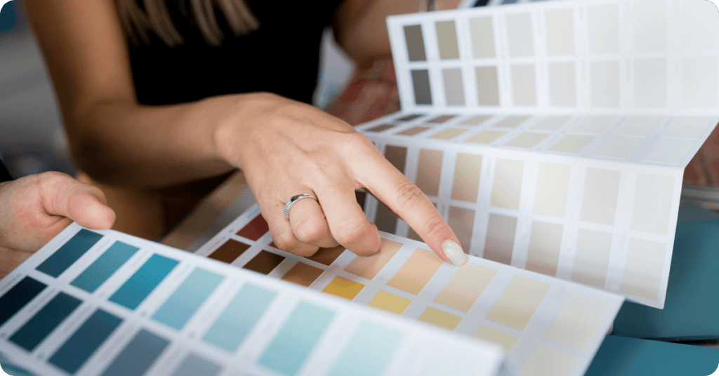
At That 1 Painter Salt Lake City, we know color isn’t just about aesthetics—it’s a subtle but powerful tool that can completely transform a space. Let’s dive into the fascinating world of color psychology and how you can use it to shape a more effective and inspiring workplace.
The Science Behind Color Psychology
Color psychology isn’t just a trendy concept in interior design—it’s a real area of research in behavioral science. Studies have shown that the colors in our environment affect our heart rate, brain activity, and emotional responses. In the workplace, these effects can translate into real-world benefits like improved focus, reduced stress, better communication, and even boosted creativity.
Here’s a quick breakdown of how colors work on a psychological level:
- Cool tones like blue and green promote calmness, clarity, and concentration.
- Warm tones such as red, orange, and yellow spark energy, passion, and innovation.
- Neutral colors like gray, white, and beige maintain professionalism and reduce overstimulation.
- Earthy tones can provide a grounding, comforting atmosphere that feels safe and stable.
Choosing the right color for each area of your office isn’t just about visual appeal—it’s about crafting an environment where people can truly thrive.
Best Colors for Focus and Concentration
Certain jobs and tasks demand razor-sharp focus. Whether your team is handling numbers, problem-solving, or managing complex projects, choosing colors that support mental clarity and minimize distraction is key.
🔵 Blue: The Ultimate Productivity Color
Blue is often considered the gold standard for productivity. It evokes calmness while stimulating clear thought and communication. It’s no wonder it’s a go-to color for tech companies, legal firms, and financial institutions.
Ideal for:
- Corporate offices
- Home offices and remote workspaces
- Data centers and administrative departments
- Technical and IT workspaces
Want to boost focus in your office? A cool, mid-tone blue can do wonders, especially when paired with white trim or natural wood accents for contrast.
🟢 Green: The Eye-Friendly Calmer
Green represents balance, renewal, and nature. Not only is it calming, but it’s also easy on the eyes—perfect for people who spend long hours in front of screens.
Use green in:
- Conference rooms for calm, productive conversations
- High-pressure environments like law offices or healthcare settings
- Workspaces with extended screen time
- Break rooms for a refreshing, nature-inspired feel
Try muted or sage greens for a more professional look, or leafy, botanical greens if you’re aiming for an energized, nature-inspired vibe.
⚪ Neutral Tones: Clean, Professional, and Unobtrusive
Neutral tones may seem basic, but they serve a critical role. Shades like gray, beige, taupe, and soft white create a clean canvas that minimizes distractions and lets your team focus.
Best used in:
- Executive offices
- Reception areas
- Shared workspaces where a “blank slate” is ideal
- Minimalist or modern office designs
Neutrals also pair beautifully with accent colors, allowing for flexibility in branding and decor.
Energizing Colors for Creativity and Innovation
When you need your space to spark new ideas, drive collaboration, or energize a team, bold colors come into play. These hues are perfect for creative industries or dynamic environments.
🟡 Yellow: Bright Ideas Begin Here
Yellow is associated with optimism, energy, and innovation. It’s a great choice when you want to stimulate the mind and encourage fresh perspectives.
Ideal spaces for yellow:
- Creative studios and design agencies
- Brainstorming zones
- Meeting rooms and collaborative hubs
- Classrooms or training areas
Keep in mind, softer shades of yellow tend to be more inviting, while bright or neon yellows should be used sparingly as accents.
🟠 Orange: The Social Spark
Orange is a vibrant, social color that promotes enthusiasm and communication. It’s less aggressive than red but still full of energy.
Use orange in:
- Breakout areas or lounges
- Informal meeting zones
- Employee cafeterias or kitchens
- Reception or client-facing spaces to create a welcoming feel
Balance bold oranges with neutral furniture or white walls to avoid visual overload.
🔴 Red: The Power Move (In Moderation)
Red increases heart rate and stimulates energy, making it perfect for spaces where passion and action are key. However, it can also be overstimulating if overused.
Great for:
- Sales floors or motivational workspaces
- Limited accent walls in high-traffic areas
- Retail spaces where urgency influences buying decisions
- Competitive environments or startups with fast-paced energy
For a sophisticated look, use deeper reds like burgundy or brick as accent colors paired with grays or whites.
Calming Colors to Support Mental Health and Balance
With workplace wellness becoming more of a priority, creating calming environments is crucial. Soft, soothing colors reduce stress, improve emotional balance, and support mental clarity.
🌊 Light Blue & Aqua: Tranquility and Trust
These hues create a sense of openness and peace, making them ideal for spaces that require calm and trust.
Perfect for:
- Healthcare and wellness offices
- HR departments
- Counseling rooms
- Quiet focus zones or meditation rooms
Pair with white or sandy beige accents for a beachy, breathable vibe.
💜 Lavender & Soft Purples: Emotional Balance
Lavender has calming properties and is known to ease tension. It also offers a unique touch of elegance and creativity.
Use lavender in:
- Therapy and coaching offices
- Employee relaxation rooms
- Spa and wellness centers
- Quiet lounges and reflection spaces
Muted purples can feel both luxurious and serene when paired with soft gray or cream furnishings.
🌿 Earthy Tones: Stability and Comfort
Browns, terracotta, and muted greens provide a grounded, warm feel. These tones evoke nature and tradition—perfect for workplaces that want to feel cozy, classic, and welcoming.
Ideal for:
- Legal firms and traditional offices
- Industrial or rustic-themed workspaces
- Hospitality and customer-service settings
- Library-style reading or research rooms
These colors pair well with natural materials like wood and stone, enhancing their soothing effect.
Matching Colors to Specific Office Areas
Every workplace has different functional zones—each with its own vibe and purpose. Here’s how to match paint colors to your space:
👩💼 Private Offices
Colors: Blue, green, soft neutrals
Goal: Focus and calm for decision-making
🧑🤝🧑 Open Workspaces
Colors: Balanced mix of calming blues and energizing yellows or oranges
Goal: Harmonize productivity and collaboration
☕ Break Rooms & Lounges
Colors: Soft greens, warm earth tones, muted purples
Goal: Relaxation and emotional refreshment
🛎 Reception Areas
Colors: Welcoming neutrals, soft yellows, warm terracottas
Goal: First impressions and a welcoming atmosphere
Why Work with Professional Painters?
While choosing paint colors can be exciting, getting it just right—and applying it with precision—is a job best left to professionals. A well-painted office not only looks better but also lasts longer and performs better in terms of mood and productivity.
At That 1 Painter Salt Lake City, we go beyond painting walls—we create environments where people love to work. Whether you’re refreshing a tired office, designing a new space, or rebranding your company with updated colors, we bring skill, color expertise, and premium results to every project.
Paint the Way to Better Performance
Color is more than decoration—it’s a powerful design element that influences how we think, feel, and work. The right colors can boost focus, reduce stress, spark creativity, and create a workplace culture that people are excited to be part of.
Don’t leave your office walls to chance. Whether you’re designing a calm counseling office or an energetic, creative space, That 1 Painter Salt Lake City can help you choose and apply the perfect colors for your brand, goals, and team.
🎨 Ready to revitalize your workspace? Contact That 1 Painter today to schedule a consultation. Let’s turn your office into a masterpiece of productivity and style.