The Ultimate 2025 Guide to Choosing the Perfect Paint Colors for Your Home
Transform Your Space with the Perfect Paint Colors
Color has the power to change everything in a space! The right paint can make a small room feel expansive, turn a dull and lifeless area into something breathtaking, and even enhance your mood. It’s not just about appearance; color impacts your emotional response to a space, influences the energy you feel in a room, and can transform your entire experience of a place. According to color psychology, the shades you choose can evoke specific feelings, from calming blues to energizing yellows. But with thousands of hues to choose from, how do you find the one that’s perfect for your space? That’s where we come in!
At That 1 Painter Salt Lake City, we believe that selecting the right paint colors isn’t just about creating a visually appealing environment—it’s about crafting a space that feels comfortable and inspiring. Whether you’re looking to make a bold statement with vibrant colors or prefer timeless, classic shades, we’re here to guide you through the process of choosing colors with confidence.
The Psychology Behind Paint Colors
Color plays a crucial role in influencing emotions, productivity, and even appetite. When choosing the right color for a room, it’s important to remember that it impacts how you interact with and experience that space every day. Below are some common categories of colors and the feelings they evoke.
Warm Colors (Reds, Oranges, Yellows)
Warm colors are stimulating and energetic. These hues are perfect for spaces designed for social interactions and activity. Think kitchens, dining rooms, and living rooms. Warm colors tend to create an inviting, lively atmosphere and can even make a space feel cozier, especially in large, open rooms.
- Red: Bold and passionate, red can increase energy and even stimulate appetite, making it ideal for dining areas and kitchens.
- Orange: Friendly and warm, orange is often used to inspire creativity and enthusiasm, making it a great choice for home offices or living rooms.
- Yellow: Often associated with happiness and optimism, yellow is perfect for spaces where you want to feel uplifted. It’s an ideal color for kitchens or other spaces that encourage socializing.
Cool Colors (Blues, Greens, Purples)
Cool colors, on the other hand, tend to create a calm, serene, and relaxed environment. These hues work wonders in spaces meant for relaxation and rest, such as bedrooms and bathrooms.
- Blue: Known for its soothing and calming effects, blue is a popular choice for bedrooms and bathrooms. Lighter blues promote relaxation, while darker blues create a sense of sophistication and comfort.
- Green: Green is closely associated with nature, making it an excellent choice for bringing a sense of balance and harmony into a space. Soft greens work well in living rooms or bedrooms, while richer shades like olive can add depth and warmth to a room.
- Purple: Though it can be energizing in certain shades, purple is typically considered a calming and spiritual color, making it a great option for bedrooms or spaces where relaxation is key.
Neutral Colors (Grays, Whites, Beiges)
Neutral colors offer versatility and timeless appeal. These shades can easily blend with other colors, allowing for flexibility when decorating and rearranging your space. They also serve as a perfect backdrop for more vibrant accents.
- Gray: Both sophisticated and serene, gray is a great neutral choice that can complement any style. Light grays create a breezy, airy atmosphere, while darker grays add an element of luxury.
- White: White exudes purity, cleanliness, and simplicity. It reflects light, helping to brighten up small rooms and giving the illusion of a larger space.
- Beige: Warm and welcoming, beige is a classic neutral that provides a calm and inviting atmosphere in living rooms and bedrooms. It pairs well with various decor styles, from traditional to contemporary.
Dark vs. Light
The contrast between dark and light colors has a profound effect on a room’s feel. Lighter colors reflect more light and can make a room feel more spacious, while darker shades absorb light and create a cozier, more intimate vibe. Light colors are ideal for small or poorly lit spaces, while dark colors are perfect for creating a rich, sophisticated ambiance.
- Light Colors: Light shades such as soft whites, pastels, and pale neutrals are ideal for brightening up a room, especially if it’s small or lacks natural light.
- Dark Colors: Darker hues, such as charcoal, navy, or deep plum, can add drama and depth, making them great choices for larger spaces or rooms where you want to create a cozy and intimate environment.
How to Pick the Best Paint Colors for Each Room
Each room in your home serves a unique function, and your color choices should enhance that purpose. Here’s a breakdown of some common rooms and how to choose the right colors for them.
Living Room: Create a Welcoming Atmosphere
The living room is often the heart of your home, where you gather with friends and family. Choose colors that encourage conversation and create a warm, inviting atmosphere.
- Beige and Taupe: Classic and versatile, these shades are warm and comforting, helping create an inviting, neutral backdrop.
- Soft Greens and Blues: These tones bring a fresh, natural element to the room, encouraging relaxation and calm conversation.
- Deep Charcoal or Navy: For a more sophisticated and timeless look, dark blues and grays add elegance while keeping the room cozy.
Bedroom: The Perfect Retreat for Relaxation
Your bedroom should feel like a peaceful retreat. The right colors can improve sleep, reduce stress, and create a serene atmosphere that promotes relaxation.
- Soft Blues and Lavenders: These calming shades are known for promoting restfulness, making them ideal for bedrooms.
- Warm Grays and Taupes: Subtle and calming, these colors create a cozy yet elegant environment, perfect for winding down.
- Deep Greens and Muted Purples: These colors add richness and depth, helping to create a tranquil, relaxing space.
Kitchen: A Space Full of Energy and Warmth
Kitchens are places of activity, where you prepare meals and often gather with family and friends. The colors you choose should reflect the warmth and energy of this space.
- Crisp Whites: Clean and bright, white reflects light and makes the kitchen feel fresh and airy.
- Soft Yellows and Warm Beiges: These shades create a welcoming, appetite-stimulating environment, perfect for a room dedicated to cooking and eating.
- Muted Greens: These colors add a fresh, organic feel, especially when paired with natural wood finishes.
Bathroom: A Spa-Like Escape
A bathroom should feel like a refreshing sanctuary, providing a space for relaxation and rejuvenation. Soft, serene colors work best here.
- Light Blues and Seafoam Greens: These colors mimic the serenity of water, creating a calm, spa-like atmosphere.
- Soft Whites and Grays: Crisp and modern, these colors help create a clean, refreshing environment.
- Pale Pinks and Lavenders: These colors add a hint of warmth and femininity, making them perfect for a tranquil bathroom retreat.
Home Office: Boost Productivity with the Right Hue
For those working from home, the right color choice can enhance focus, creativity, and productivity.
- Soft Blues: Known for promoting calm and concentration, soft blues are ideal for creating a focused workspace.
- Warm Neutrals: Neutral shades like taupe, beige, and light gray help keep distractions to a minimum, allowing you to focus on your tasks.
- Bold Accents (Mustard Yellow, Deep Green): These bold pops of color can stimulate creativity and add a professional yet energizing vibe to your office.
Top Paint Color Trends for 2025
If you’re looking for a modern touch, these trending colors for 2025 will help keep your home looking fresh and stylish.
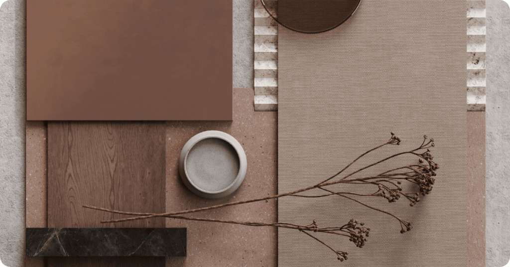
- Earthy Tones: Rich, warm shades like terracotta, olive green, and earthy browns bring a natural, grounded feel to your home, connecting indoor spaces with nature.
- Moody Blues and Deep Greens: Dark, sophisticated colors like navy, deep teal, and emerald green add a sense of drama and elegance to any space.
- Soft Pastels: Muted pinks, dusty blues, and soft lavenders continue to be popular choices for a calm, soothing aesthetic that brings a touch of serenity to any room.
- Timeless Warm Whites: Off-whites with creamy undertones bring warmth and a sense of comfort without feeling too stark, making them a versatile choice for any home.
Choosing the Right Paint Finish
Paint finish is just as important as the color. The sheen affects both the appearance and durability of the paint. Here’s a quick guide to help you choose the right finish for your space.
- Matte: Offers a soft, modern look and is perfect for ceilings and low-traffic areas.
- Eggshell: Slightly more durable than matte, eggshell is great for living rooms, bedrooms, and other medium-traffic spaces.
- Satin: Easy to clean and durable, satin is ideal for kitchens, bathrooms, and hallways.
- Semi-Gloss: Reflects light, making it perfect for trim, doors, and cabinets where a higher level of durability is required.
- High-Gloss: Highly durable and shiny, high-gloss finishes are perfect for furniture and accent details.
Pro Tips for Testing Paint Colors Before Committing
Before committing to a color, it’s important to test it to see how it looks in your space. Here are a few tips for making sure you love your color choice:
- Sample Before You Buy: Purchase small cans of your favorite shades and paint swatches on your wall. This allows you to see how the colors look in your space before making a commitment.
- Check-in Different Lighting: Lighting can dramatically alter how a color looks, so make sure to view your samples in both natural light and artificial light.
- Compare with Decor: Hold swatches up against your furniture, flooring, and fixtures to ensure the color complements your existing decor.
- Live With It: Leave the samples on your wall for a few days and see how the color feels over time. This will help you ensure it’s the perfect choice for your space.
Avoid These Common Mistakes When Selecting Paint Colors
- Ignoring Undertones: Every color has underlying hues that can clash with your decor. Pay attention to these undertones to ensure harmony in your design.
- Skipping Prep Work: Poor surface preparation leads to uneven finishes and durability issues. Properly clean and prime your surfaces before painting for the best results.
- Choosing Color in-Store: Colors look different in-store than they do in your home. Always test samples at home under different lighting conditions before making your final decision.
- Forgetting About Sheen: The wrong finish can affect both the durability and appearance of your paint. Make sure to select the right sheen for each room.
Let’s Bring Your Vision to Life!
Choosing the right paint color can completely transform the way you experience your home. Whether you’re going bold or keeping it classic, That 1 Painter Salt Lake City is here to help you make your vision a reality. Our expert painters bring years of experience and a keen eye for detail, ensuring your space looks exactly how you envision it.
Ready to give your home a fresh new look? Contact That 1 Painter Salt Lake City today for a free consultation, and let’s work together to create the home of your dreams!