That 1 Painter Color Experts: Best Paint Colors to Capture Pearland’s Unique Community
That 1 Painter is the fastest-growing painting company in the world. Painting your space can be complicated, but with our expertise, we make the process easy and stress-free for homeowners. With franchises across the nation, we have helped tens of thousands of homeowners make the best choices for their homes without sacrificing quality, and we are here to show you how.
That 1 Painter Color Experts: Best Paint Colors to Capture Pearland’s Unique Community
Colors are everywhere, influencing our lives in ways we often don’t realize. Did you know that 85% of consumers say color is the primary reason they purchase a product? Now, imagine how powerful that is when it comes to shaping community identity! In Pearland, a city that prides itself on its close-knit neighborhoods and rich cultural tapestry, choosing the right colors for public spaces, homes, and businesses is more than a design choice—it’s a way to reflect the community’s spirit.
At That 1 Painter, we believe in the transformative power of color to create environments that feel inviting, inspiring, and distinctly Pearland. Whether you’re redesigning a home or refreshing a community landmark, understanding the psychology behind colors can help you make the perfect choices.
The Power of Color in Shaping Community Identity
Color is more than just a visual element; it’s a language that speaks to our emotions and values. From the red of a fire truck symbolizing urgency to the calming blue of a park bench, every hue carries meaning.
Color as a Language
Colors evoke emotions and communicate messages without words. Warm tones like red, orange, and yellow often symbolize energy, passion, and warmth, making them great for areas meant to feel lively. Cooler colors like blue and green bring a sense of calm and tranquility, ideal for parks or residential areas.
Historical Context
Take a walk-through Pearland, and you’ll see how color choices reflect its evolving identity. From the earthy tones of older homes to the vibrant facades of new developments, Pearland’s history is written in its palette. By understanding these trends, we can honor the past while shaping the future.
Psychological Impact
Colors affect how people feel and behave. Yellow can boost optimism and energy, making it perfect for community centers, while soft greens can promote relaxation, ideal for libraries or quiet spaces. By tapping into these effects, communities can create environments that support well-being and productivity.
Key Color Psychology Principles for Pearland Communities
When selecting colors for Pearland’s spaces, it’s essential to understand how different shades affect moods and perceptions.
Warm vs. Cool Colors
- Warm Colors: Use red, orange, and yellow for high-energy spaces like gyms or playgrounds.
- Cool Colors: Apply blues and greens in areas where calmness is crucial, such as offices or meditation rooms.
Neutral Tones
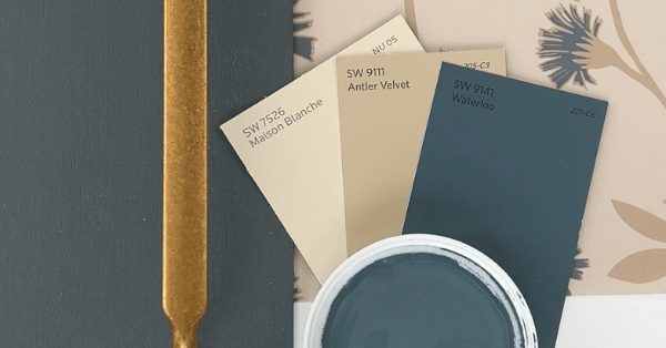
Neutral colors like beige, gray, and white serve as the perfect backdrop, offering balance and allowing accent colors to shine. They’re versatile and work well in residential areas or professional settings.
Accent Colors
Strategic use of bold colors can breathe life into otherwise subdued environments. Whether it’s a bright mural in a park or colorful trim on a historical building, these accents can make a space unforgettable.
Choosing Colors That Reflect Pearland’s Unique Character
Pearland isn’t just any city; it’s a vibrant community with its own personality. The colors we choose should reflect that unique identity.
Incorporating Local Culture and History
Pearland’s rich heritage is an excellent source of inspiration. Drawing from historical landmarks and cultural festivals, you can integrate colors that celebrate the city’s roots.
Natural Surroundings
Pearland’s beautiful landscapes—think lush parks and serene ponds—offer a natural color palette. Earthy greens, soft browns, and sky blues can bring the outdoors in, creating a harmonious connection between indoor and outdoor spaces.
Community Input
Involving residents in the decision-making process ensures the colors chosen resonate with the people who live there. Community workshops or surveys can help gather insights on preferred palettes and create a sense of ownership and pride.
Practical Applications of Color Psychology in Pearland
Understanding color psychology is one thing; applying it effectively is another. Here’s how Pearland can benefit from thoughtful color selection across different spaces.
Residential Spaces
- Exterior Colors: Choose hues that complement the neighborhood while allowing individuality. Light tones can make homes appear larger, while darker shades add sophistication.
- Interior Spaces: Use warm tones in kitchens and living rooms to foster connection, and cool shades in bedrooms for relaxation.
Public Spaces and Landmarks
- Parks and Recreational Areas: Greens and blues enhance natural beauty and promote relaxation.
- Civic Buildings: Neutral tones with bold accents can convey professionalism while remaining welcoming.
Business Districts
In commercial areas, cohesive color schemes can create a unified look while allowing each business to maintain its identity. Vibrant accents can attract attention without overwhelming the aesthetic.
Common Mistakes to Avoid in Community Color Selection
Even with the best intentions, mistakes in color selection can disrupt the harmony of a community’s aesthetic. Here’s what to watch out for.
Ignoring Context
A color scheme that works in one area may clash in another. It’s vital to consider the architectural style, surrounding environment, and purpose of the space.
Overuse of Bold Colors
While bold colors can make a statement, too much can overwhelm the senses and create visual clutter. Use them sparingly for maximum impact.
Neglecting Maintenance Needs
Pearland’s climate can be tough on paint. Choosing weather-resistant, easy-to-clean finishes ensures colors stay vibrant and spaces remain beautiful over time.
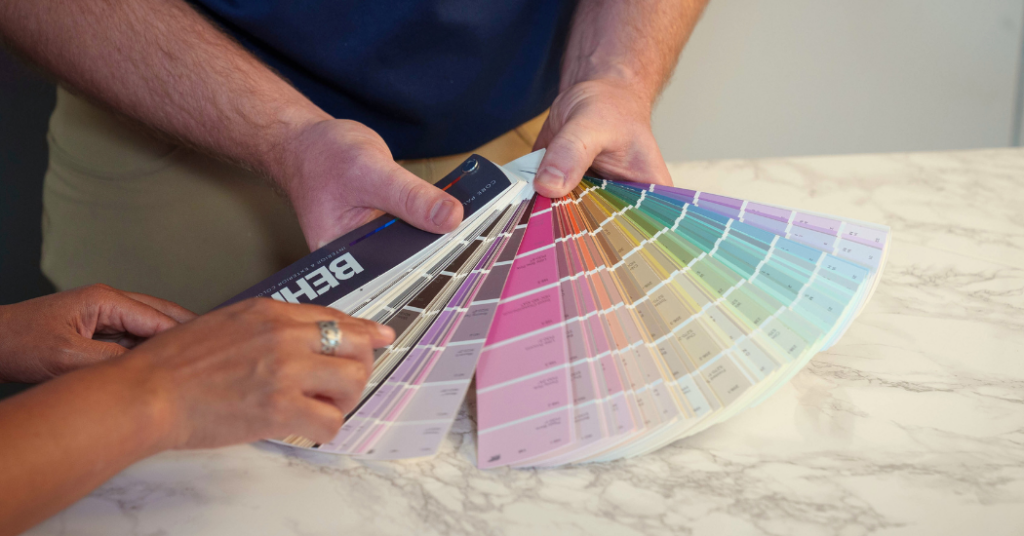
The Role of Professional Painters in Achieving Color Harmony
While anyone can pick a color, achieving a cohesive and lasting look requires expertise. That’s where professional painting services come in.
Expert Guidance on Color Trends and Compatibility
At That 1 Painter, we stay on top of the latest color trends and understand how to pair shades for maximum impact. We’ll help you choose colors that not only look great but also align with your vision.
Efficient Execution
Painting a community space or a home is a big project. Our team ensures a smooth process from start to finish, handling everything from prep work to the final coat with precision and care.
Long-Lasting Quality
We use high-quality paints and materials designed to withstand Pearland’s weather, so your colors stay fresh and vibrant for years.
Let That 1 Painter help you create a space that perfectly captures your unique vision and Pearland’s vibrant identity.
Colors shape our world, especially in a community as dynamic as Pearland. They tell stories, evoke emotions, and bring people together. Whether you’re refreshing your home or reimagining a public space, the right colors can make all the difference. Ready to transform your space? Reach out to That 1 Painter Pearland today for a free estimate!