Choose the Right Interior Paint Color for Your Home with That 1 Painter Ontario-Fontana
That 1 Painter is the fastest-growing painting company in the world. Painting your space can be complicated, but with our expertise, we make the process easy and stress-free for homeowners. With franchises across the nation, we have helped tens of thousands of homeowners make the best choices for their homes without sacrificing quality, and we are here to show you how.
Choose the Right Interior Paint Color for Your Home with That 1 Painter Ontario-Fontana
Color can completely change how your home feels, calm and cozy, bold and modern, or bright and lively. The right paint color doesn’t just improve aesthetics; it can influence your mood, increase your home’s value, and even make a space feel bigger or more intimate. According to a Zillow study, homes with light blue bathrooms sold for $4,698 more on average. That’s the power of paint.
In Ontario-Fontana, where sunny days meet suburban comfort and diverse architectural styles, choosing the perfect interior color is more than just picking your favorite shade. It’s about enhancing your lifestyle, matching the local vibe, and making your house feel like a home. At That 1 Painter Ontario-Fontana, we know color. We’ve painted hundreds of interiors across neighborhoods like Rancho Vista, Southridge Village, and Ontario Ranch. Let’s explore how you can confidently choose a color that fits your home, personality, and this vibrant Southern California community.
Understand How Light Affects Paint in Ontario-Fontana Homes
Ontario-Fontana enjoys around 280 sunny days a year. That’s fantastic for outdoor living, but it also means natural light plays a big role in how your interior colors appear. A soft beige might look creamy in the morning but appear washed out at noon.
Here’s how sunlight and orientation affect paint:
- North-facing rooms: Light tends to be cooler and dimmer. Warm tones like buttery yellows or soft terracottas can cozy up the space.
- South-facing rooms: These get the most light, so cooler tones like sage green or sky blue hold their color without getting too warm.
- East-facing rooms: Bright in the morning, dimmer in the afternoon. Pick colors that look good in both natural and artificial light.
- West-facing rooms: Warm golden-hour light can amplify reds and oranges—good for dining rooms or cozy dens.
Before you commit to a color, test a few swatches at different times of the day. What looks great at noon might feel entirely different at dusk.
Match Colors to Your Ontario-Fontana Home’s Style and Personality
Ontario and Fontana have a wide variety of homes—Spanish-style bungalows, contemporary townhouses, mid-century ranch homes, and Mediterranean-style villas. Each style has color palettes that naturally complement its features.
Classic color matches for local architecture:
- Spanish/Mediterranean homes: Earth tones like warm taupe, terracotta, olive green, and soft white make great interior companions to red tile roofs and arched windows.
- Modern builds: Think crisp whites, cool grays, and matte blacks to highlight clean lines and minimalist features.
- Traditional suburban homes: Soft pastels, greige, and buttery neutrals pair well with family spaces and layered furniture styles.
Don’t forget your own personality. Are you drawn to calm, serene environments? Consider soft blues or muted greens. Prefer drama? A bold navy accent wall in your dining room might be just the thing.
Use Color Psychology to Enhance Each Room
Paint color can affect how you feel in a room. This is especially important in your own home, where you want each space to support its purpose—whether that’s productivity in your home office or relaxation in your bedroom.
Consider these room-by-room color tips:
- Living room: Warm neutrals like almond, oatmeal, or soft golds create a welcoming atmosphere perfect for guests.
- Kitchen: Sage green or light gray feels fresh and clean—ideal for a space where you cook and gather.
- Bedroom: Soft blues, lavenders, or muted blushes support rest and calm.
- Bathroom: Cool tones like pale aqua or icy gray suggest cleanliness and peace.
- Home office: Energizing colors like light orange or subtle teal can boost focus and creativity.
Color psychology works best when balanced with the natural light and existing furnishings in each room.
Keep Neighborhood Trends in Mind Without Sacrificing Uniqueness
Fontana and Ontario have fast-growing housing developments. That means buyers and homeowners alike are paying attention to what’s popular. While you don’t need to follow every trend, it’s smart to know what others are doing—especially if resale value is on your radar.
Popular interior paint trends in the Inland Empire right now include:
- Soft whites with warm undertones
- Greige (a gray-beige hybrid that plays well with any decor)
- Sage green for kitchens and bathrooms
- Deep navy or forest green accent walls
- Muted clay tones like adobe and rust
That said, trends come and go. What matters most is that you love your space. We always encourage Ontario-Fontana homeowners to personalize their color choices with meaningful touches, like an accent wall in your child’s favorite color or a powder room painted in a moody hue just because it makes you smile.
Choose the Right Finish for the Right Room
Color is only part of the equation. The finish of your interior paint can make or break the final result. Ontario-Fontana homes often experience dry heat and high traffic in shared areas, so durability matters.
Here’s a breakdown of finishes and where they work best:
- Flat/matte: Best for ceilings and low-traffic areas. Hides imperfections well, but tough to clean.
- Eggshell: A subtle sheen that’s great for living rooms and bedrooms. It’s slightly washable.
- Satin: Durable and easy to clean, perfect for high-traffic areas like hallways, kitchens, and bathrooms.
- Semi-gloss: Ideal for trim, doors, and cabinets—easy to wipe down and resistant to moisture.
- High-gloss: Super shiny and durable, often used for furniture or statement trim pieces.
In Ontario-Fontana’s sunny, dust-prone environment, satin or eggshell finishes usually strike the right balance between beauty and practicality.
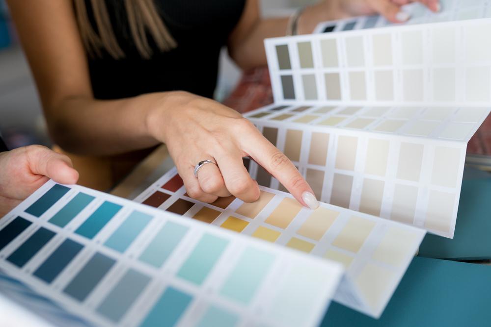
Sample Before You Commit
Paint swatches on paper can lie. That same light gray might look greenish once it’s on your wall, especially in changing natural light. Sampling is a must, especially in this area where sunny conditions can drastically affect how color is perceived.
Follow these sampling tips:
- Paint swatches directly on your wall at eye level.
- Use at least a 12×12 inch square for each sample.
- Observe how the color looks in morning, afternoon, and evening light.
- Consider placing the sample near existing furnishings like rugs, curtains, or artwork to see how it plays with the room’s palette.
We also recommend using peel-and-stick sample squares if you want to avoid painting directly onto your walls.
Coordinate with Existing Furniture and Decor
Your walls are the backdrop for everything else in your home. If you already love your couch, dining table, or art collection, let those elements guide your paint decisions.
Here’s how to pull it all together:
- Start with what you love: Choose a color that complements a favorite rug, pillow, or piece of art.
- Stick to a palette: Pick a base neutral, a couple of accent colors, and a bold tone if desired.
- Repeat colors: Use the same or similar colors in different rooms for a cohesive flow.
In open-concept homes common in Fontana and Ontario, visual continuity is especially important. A cohesive palette helps create a sense of unity and flow.
Don’t Be Afraid to Go Bold in Small Spaces
People often think small spaces need light colors to feel bigger. That’s not always true. In fact, deep colors in tight spots can create intimacy and drama. Think powder rooms, reading nooks, or entryways.
A charcoal gray powder room? A deep emerald reading nook? These bold choices feel luxurious, especially when paired with good lighting and the right decor.
In sunny Ontario-Fontana, where natural light is abundant, even bold colors don’t feel too heavy. The key is balance.
Trust a Local Painting Expert Who Knows Ontario-Fontana
Choosing the right paint color can feel overwhelming with all the choices out there. That’s where we come in.
At That 1 Painter Ontario-Fontana, we don’t just show up with a roller and a drop cloth. We help you pick the perfect palette, suggest finishes that suit your lifestyle, and bring color to life in a way that reflects who you are.
We understand how the SoCal light changes your walls throughout the day. We know what color trends are hot in Ontario Ranch, Rosena Ranch, and downtown Fontana. And we care about making your home feel like home.
Whether you’re repainting a single room or refreshing your whole interior, we’re here to help with precision, personality, and a splash of fun. Contact us at That 1 Painter Ontario-Fontana today to start your home transformation!