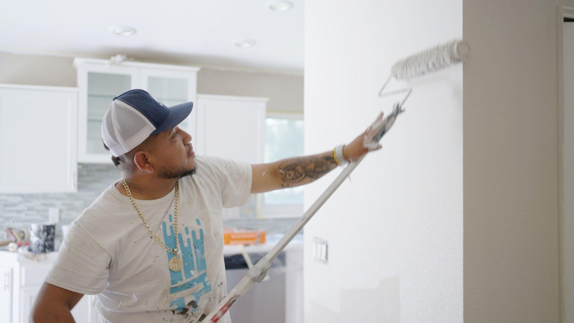
That 1 Painter is the fastest-growing painting company in the world. Interior painting trends can be complicated, but with our expertise, we make the process easy and stress-free for homeowners. With franchises across the nation, we have helped tens of thousands of homeowners embrace interior painting trends without sacrificing quality, focusing on the latest interior painting trends, and we are here to show you how.
Color Psychology: Transform Your Home with the Power of Paint
Did you know the colors in your home could be shaping how you feel—every single day? Color psychology isn’t just a fun design trend; it’s rooted in science and psychology. Colors affect our emotions, energy levels, behavior, and even our ability to focus or relax. That’s why choosing the right paint color isn’t just about what looks good—it’s about how you want to feel in each room of your home.
At That 1 Painter The Woodlands, we believe your home should be a reflection of you. Our mission is to help you create a space that inspires, soothes, energizes, or comforts—whatever you need, room by room. With a brushstroke and the perfect hue, we bring color psychology to life in ways that make a real difference in your everyday living.
Let’s explore how color influences emotion and how you can use that insight to build a more intentional, beautiful home.
What is Color Psychology?
Color psychology studies how colors influence human mood, behavior, and perception. While we all have personal associations with colors—maybe blue reminds you of the ocean, or red of your childhood kitchen—scientific studies show that many emotional responses to color are shared across cultures and age groups.
For example, blue is commonly associated with calmness and trust. Red often signals energy, urgency, or passion. Green evokes nature and balance. These are more than just impressions—they’re deeply ingrained reactions that affect our heart rate, our thoughts, and even our choices.
That’s why interior designers, marketers, and architects use color strategically. And it’s why you should too when painting your home.
How Colors Affect Your Mood
Let’s walk through some of the most common colors and how they interact with our emotions:
Red is high-energy and powerful. It raises heart rates, grabs attention, and stimulates conversation. A red accent wall in a dining room can create a sense of intimacy and drama, encouraging people to linger longer over meals. But too much red can feel overwhelming or aggressive, so it’s best used as an accent or in rooms with ample natural light.
Blue is the color of calm and serenity. Light blues can make a room feel airy and open, perfect for bedrooms or bathrooms. Deeper blues—like navy or cobalt—add richness and elegance, ideal for formal dining areas or cozy dens. Blue can also help lower blood pressure and slow respiration, which makes it one of the most effective colors for promoting relaxation.
Yellow radiates optimism. It’s cheerful, vibrant, and full of energy. Used thoughtfully, yellow can make small spaces feel more open and welcoming. It’s perfect for kitchens, entryways, and creative spaces. However, in large doses, especially in very bright shades, it can be overstimulating and even trigger anxiety. Pairing it with neutrals can balance out its intensity.
Green is associated with nature, health, and tranquility. It’s a versatile color that works in almost any room, from bedrooms to kitchens to home offices. Green balances the calming nature of blue with the energy of yellow, making it ideal for encouraging focus and harmony.
Purple blends the intensity of red with the calmness of blue. Lighter purples like lavender offer a soothing atmosphere, while richer purples like plum or eggplant feel luxurious and dramatic. It’s a great color for bedrooms, meditation spaces, or any room where you want to promote creativity and introspection.
Orange combines the enthusiasm of red with the friendliness of yellow. It’s often used in exercise rooms or kitchens where a boost of energy and sociability is welcome. Softer tones like terracotta or peach are especially effective in creating warmth without being too loud.
Neutrals like white, beige, gray, and taupe provide a flexible foundation. They create a sense of cleanliness and openness and can be paired with almost any color to establish balance. In homes that receive a lot of natural light, these tones can shift throughout the day, adding subtle variation and interest without ever feeling stale.
Room-by-Room Guide to Color Psychology
Living Room
The living room is your home’s social hub. It’s where you relax, entertain guests, and spend quality time with family. That’s why choosing a versatile, welcoming color palette is key. Warm neutrals like creamy beige or greige provide a perfect canvas for layering with colorful accents. If you want to add a pop of personality, an accent wall in olive green, rust, or navy can introduce visual interest and emotional depth.
Natural textures—like wood, stone, or linen—also play beautifully with earth tones, enhancing the sense of comfort and connection. The goal is to make the space feel grounded and warm without becoming too busy or overwhelming.
Kitchen
The kitchen is more than just a place to cook—it’s where life happens. It’s where your day begins, conversations flow, and meals are shared. That’s why cheerful, energizing colors work so well here.
Soft yellows, muted coral, or light sage can bring warmth and vitality without overpowering the space. If you prefer a sleek, modern kitchen, cool grays and navy blues paired with white countertops and metal hardware offer a clean, elegant aesthetic. Cabinet colors can make a major impact—consider soft green or dusty blue for a refreshing twist.
Lighting is essential in the kitchen, so always test paint swatches under the lights you’ll be using most.
Bedroom
The bedroom is your escape from the chaos of the outside world. It’s where peace and privacy should be the priority. That’s why calming colors like dusty blue, lavender, soft taupe, and pale green are top choices for bedrooms. They encourage relaxation, better sleep, and a tranquil environment.
Layering tones of the same color—for example, pairing a sky-blue wall with navy textiles—can make the space feel more intentional and cohesive. If you want to create a romantic mood, deeper colors like wine or deep plum paired with warm lighting can make your bedroom feel cozy and luxurious.
Bathroom
Your bathroom can feel like a personal spa with the right colors. Whites, seafoam green, cool grays, or light aqua tones help create a fresh, clean atmosphere. These shades also make small bathrooms appear more spacious. Mirrors, tile textures, and natural elements like bamboo or stone all complement these hues, making the space feel open and refreshing.
Even in a powder room, which might not see much daily use, bold colors can make a fun statement. Try a jewel tone or high-gloss finish for a bit of glam.
Home Office
With more people working remotely, the home office has taken on a new level of importance. This space needs to inspire focus, productivity, and a sense of calm.
Greens are excellent for reducing stress and increasing efficiency, while soft blues help maintain a sense of order. Want to spark creativity? Introduce touches of orange, coral, or mustard in your decor. Avoid overly bright or clashing colors that can cause distraction. A well-balanced palette promotes mental clarity and keeps you motivated.
Entryway and Hallways
These transitional spaces are often overlooked, but they set the tone for the entire home. A welcoming entryway can immediately establish comfort and style. Muted tones like sand, blush, or dusty blue work well in hallways, while deeper shades—like forest green or charcoal—can be striking in foyers with good lighting.
Because these areas often have less natural light, it’s crucial to test how colors look throughout the day with artificial illumination.
The Role of Light and Finish
Color psychology doesn’t exist in a vacuum—it changes with light. A color that looks warm and cozy in daylight might feel dull or cold under fluorescent bulbs. That’s why we always recommend sampling paint swatches on your walls and observing them throughout the day.
Finish matters too. Matte finishes are great for hiding imperfections and giving a soft, velvety appearance, perfect for bedrooms and living rooms. Satin and eggshell finishes are slightly reflective and ideal for kitchens and hallways due to their durability. Glossy finishes are bold and reflective—best used sparingly on trim, doors, or accent pieces.
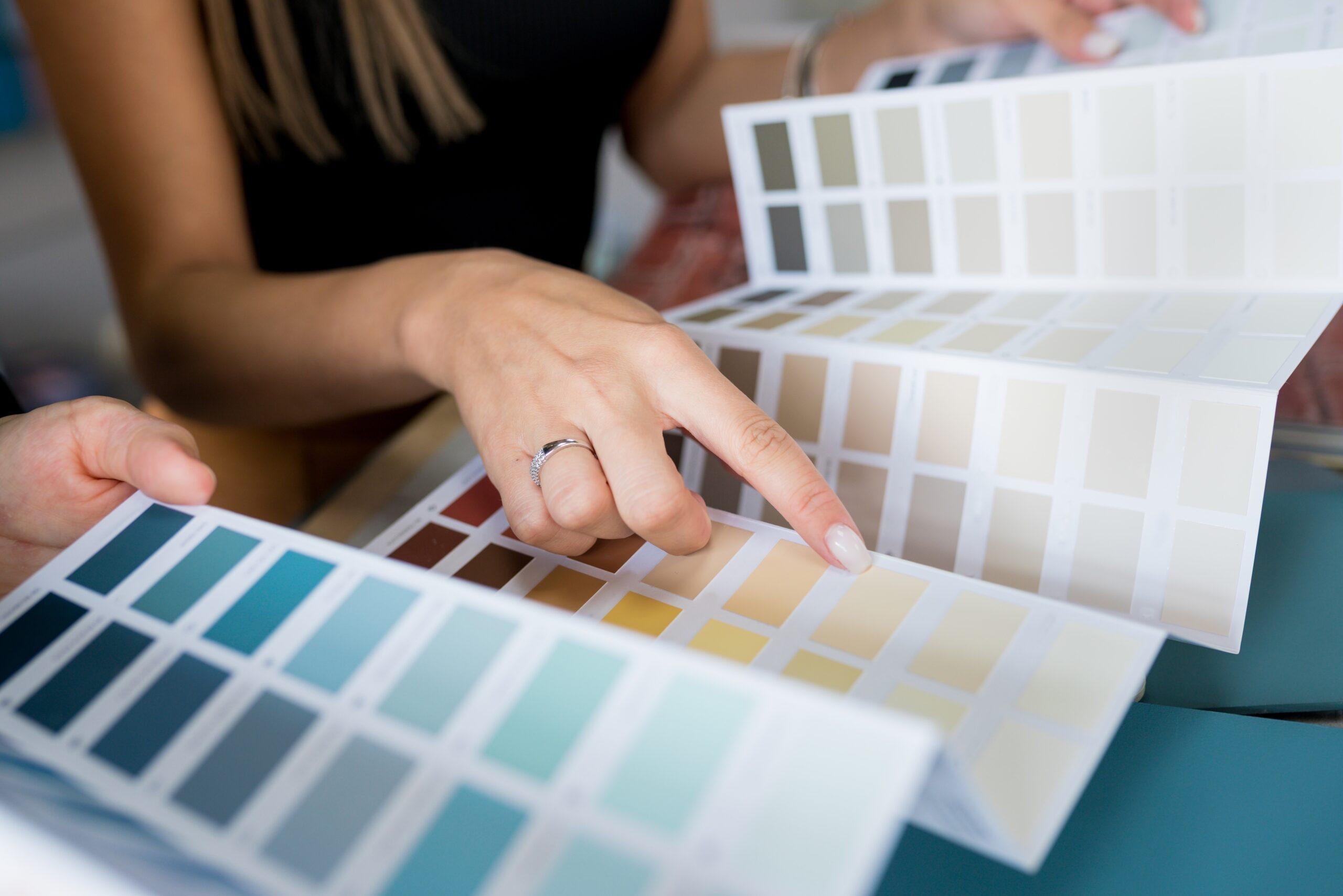
How to Build a Cohesive Color Scheme
Your home should feel like a unified space, not a collection of disjointed rooms. Building a cohesive color scheme starts with deciding on a base palette—typically a neutral or soft tone you can carry from room to room. Then, choose 2–3 accent colors that complement this base. This creates a sense of flow and continuity.
Don’t forget about transition areas like stairways and hallways—these should blend naturally with both the space you’re coming from and the one you’re entering. Subtle differences in shade or finish can help delineate spaces without disrupting the harmony.
If you’re feeling stuck, start with one room and build outwards. A favorite piece of furniture, a rug, or even a piece of art can inspire a palette you carry throughout your home.
Trends for 2025: Emotion-Led Design
Color trends in 2025 are all about emotion. We’re seeing a shift from pure aesthetics to purpose-driven color choices. Homeowners want spaces that feel good, not just look good.
Rich earth tones like terracotta, sienna, and ochre are replacing sterile grays, adding warmth and authenticity. Blues and greens inspired by nature—like ocean teal or eucalyptus—are surging in popularity for their calming properties. Meanwhile, warm neutrals like latte, sandstone, and mushroom provide the perfect foundation for layers of color and texture.
Soft pinks and sun-washed reds are also trending, offering a subtle touch of personality and optimism without overwhelming a space. These colors reflect a desire for comfort, well-being, and connection in our homes.
Let That 1 Painter The Woodlands Bring Your Vision to Life
Choosing paint colors can be overwhelming—but it doesn’t have to be. At That 1 Painter The Woodlands, we guide you through the entire process with expert advice rooted in color psychology, design trends, and personalized attention.
We believe your home should reflect who you are and how you want to live. Our experienced team takes time to understand your style, lighting, furniture, and goals so we can help you choose the perfect palette for every room. We combine high-quality materials with precision and professionalism to deliver a painting experience that’s seamless and satisfying.
Whether you’re going bold in the dining room, serene in the bedroom, or vibrant in your kitchen, we’re here to make sure every stroke of color brings joy and balance into your life.
Contact us today to schedule your free consultation and let That 1 Painter The Woodlands show you how the perfect colors can bring beauty, emotion, and personality into your home.