That 1 Painter is the fastest-growing painting company in the world. Painting your space can be complicated, but with our expertise, we make the process easy and stress-free for homeowners. With franchises across the nation, we have helped tens of thousands of homeowners make the best choices for their homes without sacrificing quality, and we are here to show you how.
Color Psychology in the Workplace: How Paint Choices Affect Productivity
Think the color of your office walls doesn’t matter? Think again. Studies have shown that paint color influences how we feel, think, and even perform at work. From calming hues that help with focus to energizing shades that drive creativity, your color choices can make a measurable difference in productivity and mood.
At That 1 Painter High County, we know firsthand that paint isn’t just about aesthetics—it’s about creating environments that empower your team to do their best work. In today’s workplace, where mental health and efficiency are top priorities, choosing the right colors is one of the smartest moves you can make.
Let’s take a look at the science of color psychology and how thoughtful paint choices can upgrade your workspace—without a total renovation.
The Psychology of Color: How It Affects Your Mind and Mood
Color psychology is a legitimate field of research in behavioral science, not just a buzzword in design circles. The colors around us can influence everything from heart rate and stress levels to concentration and collaboration.
When applied strategically in office environments, colors can directly impact how people work, feel, and interact. Here’s a breakdown of common color categories and how they shape emotional and cognitive responses:
- Cool tones like blue and green encourage calm, focus, and mental clarity.
- Warm tones such as red, yellow, and orange generate energy, passion, and creativity.
- Neutral colors—gray, white, beige—offer a clean, unobtrusive backdrop for productivity.
- Earthy shades evoke a sense of warmth, comfort, and stability.
By tailoring your color palette to each workspace, you can design a more productive, emotionally balanced office.
Best Colors for Focus and Mental Clarity
If your team tackles detail-oriented tasks, manages data, or operates in high-stress roles, you’ll want to incorporate colors that boost concentration and reduce distractions.
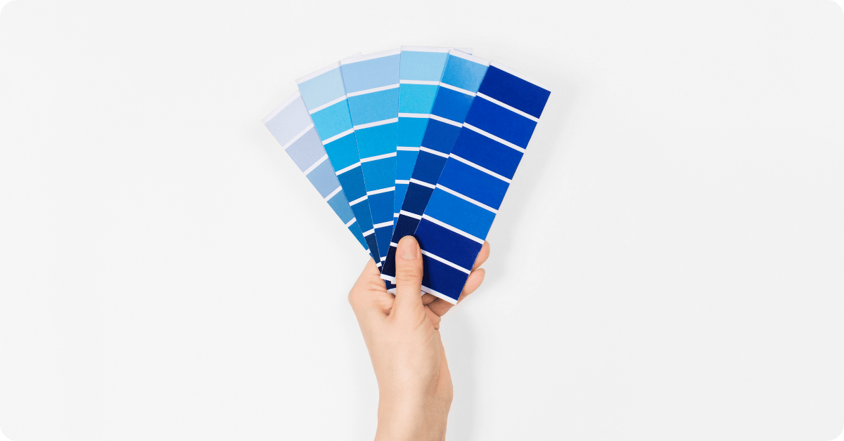
🔵 Blue: The King of Productivity
Blue is widely considered the best color for workspaces. It supports calm thinking while enhancing focus and communication. It’s a favorite among finance, tech, and legal professionals for a reason.
Use blue in:
- Executive offices
- Home offices and private work areas
- IT or operations departments
- Administrative or analytical teams
A muted or medium-toned blue with white trim or wood accents creates a polished, professional vibe.
🟢 Green: Calm and Screen-Friendly
Green symbolizes balance and growth. It’s also incredibly soothing to the eyes—perfect for anyone who spends long hours in front of screens.
Best areas for green:
- Conference rooms
- High-pressure departments (e.g., healthcare or law)
- Design studios
- Break rooms with lots of natural light
Opt for sage or dusty green for a grounded look, or go bold with lush botanical tones.
⚪ Neutrals: Clean, Flexible, and Professional
Neutral tones like gray, beige, and white are anything but boring. They create a distraction-free zone while adding sophistication and flexibility.
Ideal for:
- Shared office spaces
- Reception areas
- Corporate headquarters
- Minimalist or modern workspaces
Pair neutrals with strategic pops of color to reflect your brand identity without overwhelming the space.
Energizing Colors That Spark Innovation
Need to get the creative juices flowing? Looking to inspire more collaboration and excitement? Bold, warm tones can add that extra energy boost.
🟡 Yellow: For Bright Ideas and Positive Vibes
Yellow is the color of optimism and originality. Use it to lift spirits and promote innovative thinking.
Perfect for:
- Design departments and marketing teams
- Meeting rooms and idea zones
- Training centers or workshops
- Classrooms or co-working spaces
Soft butter yellows invite warmth, while bolder shades should be used sparingly for accent walls or decor.
🟠 Orange: Collaboration and Connection
Orange encourages communication and movement. It’s a great fit for areas where people gather, relax, or socialize.
Great for:
- Breakout areas and employee lounges
- Informal meeting spots
- Cafeterias or shared kitchens
- Client greeting areas
Pair with neutral tones and minimalist furnishings to maintain balance and avoid overstimulation.
🔴 Red: For Bold Energy and High-Impact Zones
Red increases alertness and heart rate—it’s great for stimulating fast thinking and action, but it should be used in moderation.
Try red in:
- Sales areas
- Startup offices with dynamic culture
- Small retail zones
- Accent walls in creative spaces
Deep burgundy or rust reds pair beautifully with industrial elements or modern grays.
Creating Calming Zones for Mental Wellness
Incorporating soothing colors can help reduce anxiety, encourage mindfulness, and support a more balanced workplace—especially important in today’s fast-paced world.
🌊 Light Blue & Aqua: Trust and Tranquility
These hues bring a breath of fresh air into a space. They promote peace, openness, and emotional balance.
Use them in:
- Wellness rooms or quiet zones
- HR offices and counseling spaces
- Healthcare settings
- Meditation or recharge areas
Pair with soft neutrals or natural textures for a serene escape.
💜 Lavender & Soft Purples: Serenity with Style
Lavender promotes calm while also adding elegance and a subtle creative spark.
Great for:
- Coaching and therapy offices
- Employee wellness rooms
- Reflection spaces and lounge areas
- Spa or salon work environments
Lavender and plum shades pair beautifully with cream or charcoal furnishings for a calming yet elevated feel.
🌿 Earth Tones: Stability and Warmth
Tans, browns, and olive greens create a cozy, grounded atmosphere that feels stable and familiar.
Use earth tones in:
- Legal and accounting firms
- Rustic, hospitality-style workspaces
- Reading rooms or libraries
- Traditional client-facing offices
These colors are ideal when combined with materials like wood, stone, and linen.
Matching Colors to Key Office Spaces
Different zones in your office serve different purposes—your paint colors should reflect that.
👨💼 Private Offices
Colors: Blue, green, neutral tones
Goal: Enhance concentration and decision-making
🧑🤝🧑 Open Work Areas
Colors: Balanced mix of neutrals and energizing tones
Goal: Blend collaboration with focus
☕ Break Rooms
Colors: Earthy shades, soft purples, calming greens
Goal: Provide a place to recharge and de-stress
🛎 Reception & Waiting Areas
Colors: Welcoming neutrals, soft oranges or yellows
Goal: Create positive first impressions
Why Work with That 1 Painter High County?
Selecting the right color is just the beginning—applying it properly and professionally is what brings your vision to life.
At That 1 Painter High County, we specialize in transforming commercial and office spaces through color. Whether you’re revamping a single office or redesigning an entire floor, our experienced team ensures a seamless, high-quality finish.
What You Get with Us:
- Expert Color Consultation tailored to your business type and goals
- Top-tier paints formulated for high-traffic, commercial settings
- Professional application for a flawless, long-lasting finish
- Minimal disruption to your work schedule
- Satisfaction guaranteed
Ready to Energize Your Office Space?
Color is more than just a visual element—it’s a silent force that shapes your company culture, productivity, and employee well-being. From cool blues for focus to energetic yellows for creativity, you have the power to design a workplace that truly works.
🎨 Let That 1 Painter High County help you transform your office into a space where people feel inspired to show up and do their best.
Contact us today to schedule a color consultation or request a quote. Let’s turn your workspace into a place of purpose, creativity, and comfort—one brushstroke at a time.