That 1 Painter is the fastest-growing painting company in the world. Painting your space can be complicated, but with our expertise, we make the process easy and stress-free for homeowners. With franchises across the nation, we have helped tens of thousands of homeowners make the best choices for their homes without sacrificing quality, and we are here to show you how.
How to Choose the Perfect Paint Colors for Your Home with That 1 Painter Greater Boston!
“Color is a power which directly influences the soul.” — Wassily Kandinsky.
Transform Your Greater Boston Home with the Power of Color
Your walls do more than just hold up a roof—they set the tone for every moment spent in your home. Color impacts your mood, your energy, and even how spacious or cozy a room feels. Whether you’re gearing up for a total home makeover or just refreshing a few rooms, choosing the perfect paint color can make all the difference. But with thousands of shades and finishes out there, how do you know which one is truly “the one”?
At That 1 Painter Greater Boston, we understand that the perfect paint color isn’t just a design choice—it’s a personal one. Our mission is to help you bring your vision to life with expert painting services that match your unique style, whether you’re going bold, bright, soft, or serene. Let’s explore how the right color can transform your home from ordinary to unforgettable.
The Psychological Impact of Paint Colors in Your Home
Color isn’t just about appearance—it’s about emotion, energy, and how you interact with your space. Each hue can trigger a different psychological response, making it essential to match your color choices with how you want to feel in each room.
Warm Colors: Inviting and Energetic
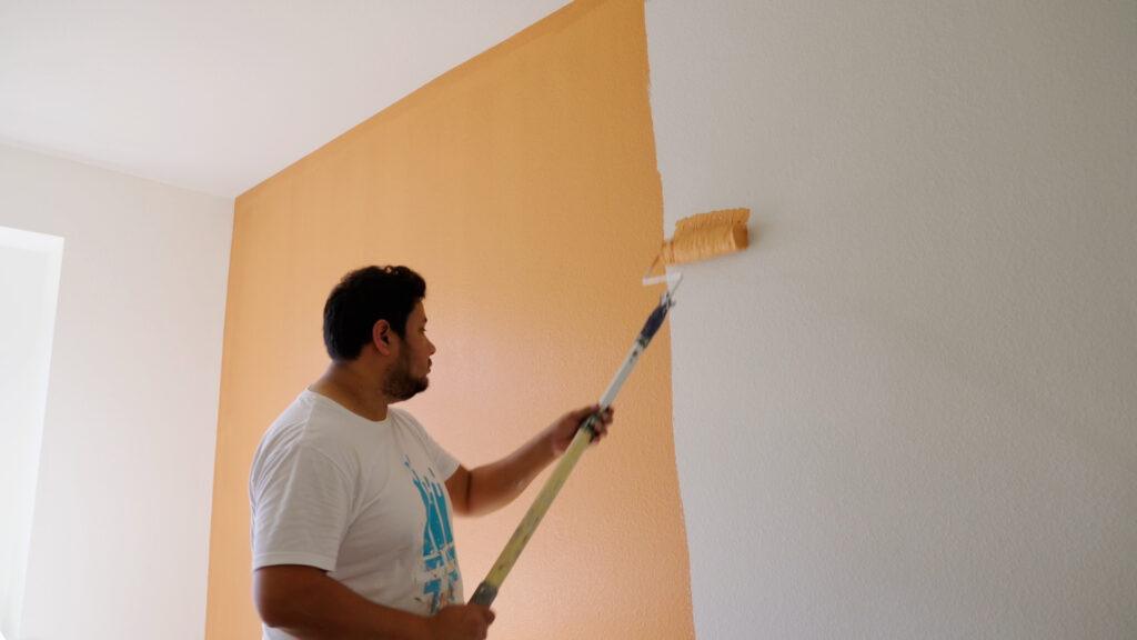
Warm tones like red, orange, and yellow are known to energize and stimulate. These are perfect for areas where you want to promote conversation, connection, and liveliness—think kitchens, dining rooms, and family gathering spaces. A pop of burnt orange or a buttery yellow can make your space feel bright and cheerful, even on those gray Boston days.
Cool Colors: Peaceful and Calming
Blues, greens, and purples create a sense of calm and tranquility. They’re ideal for bedrooms, bathrooms, and spaces meant for rest and reflection. Imagine stepping into a soft seafoam green bathroom after a long day or waking up in a serene blue bedroom that instantly sets a peaceful tone.
Neutral Colors: Flexible and Timeless
Neutrals like gray, beige, and soft white act as the perfect backdrop for any style. They offer versatility and balance, pairing well with vibrant accents or minimalist designs. These colors are staples for open-concept living spaces or transitional home designs common in Greater Boston neighborhoods.
Light vs. Dark Colors: Creating Space and Depth
Lighter shades can make a small room feel airy and expansive, while darker hues create intimacy and depth. A light greige in a small guest room opens up the space, whereas a deep navy in a library or study adds drama and warmth.
Best Paint Colors for Every Room in Your Home
Each room has its own vibe, purpose, and flow. The right color not only complements the space but enhances how it feels and functions. Let’s dive into the top paint color strategies by room.
Living Room: Where Warmth Meets Welcome
Your living room is the heart of your home. It’s where stories are told, memories are made, and comfort is key.
- Beige and Taupe: These warm neutrals never go out of style. They provide a cozy backdrop that works with almost any decor.
- Soft Greens and Blues: Bring nature indoors with calming, earthy tones. Perfect for relaxed, modern spaces.
- Charcoal and Navy: Add sophistication and depth, especially when paired with white trim or wooden accents.
Bedroom: Your Personal Sanctuary
Bedrooms should feel like a retreat—a space to unwind, recharge, and breathe.
- Soft Blues and Lavenders: These cool hues promote relaxation and better sleep.
- Warm Grays and Muted Taupes: Offer cozy elegance without overwhelming the senses.
- Deep Greens and Dusty Purples: For a rich, luxurious feel that remains calming and grounded.
Kitchen: Full of Flavor and Energy
The kitchen is where life happens—from busy breakfasts to late-night snacks.
- Crisp Whites: Create a clean, bright canvas that reflects light and makes the space feel larger.
- Soft Yellows and Warm Beiges: These shades are inviting and can even enhance appetite.
- Muted Greens: Add an organic touch that pairs beautifully with wood or brass accents.
Bathroom: Spa Vibes All Day Long
Transform your bathroom into a peaceful escape with color choices that speak to cleanliness and calm.
- Light Blues and Seafoam Greens: Echo the soothing presence of water.
- Soft Grays and Creamy Whites: Keep things clean, crisp, and modern.
- Pale Pinks and Lavenders: Add a subtle, warm glow for a unique, refreshing aesthetic.
Home Office: Productivity Meets Comfort
More homeowners in the Greater Boston area are working remotely. A productive workspace starts with a smart color palette.
- Cool Blues: Promote concentration, clarity, and calm.
- Warm Neutrals: Minimize distraction and encourage focus.
- Accent Colors: Try a bold mustard yellow or a deep green for an inspiring pop that fuels creativity.
Trending Paint Colors You’ll Love Right Now
Want to stay on-trend while still creating a timeless feel? These current color trends are making waves across Greater Boston homes.
Earthy Tones
Warm browns, terracottas, and olive greens are rooted in nature and bring a grounded, organic feel to any room. These shades pair beautifully with natural wood, stone, and greenery.
Moody Blues and Deep Greens
Dark and dramatic, these shades offer sophistication and boldness without sacrificing comfort. Ideal for accent walls or entire rooms where you want to make a statement.
Soft Pastels
From muted blush pinks to dusty lavenders and misty blues, these gentle shades evoke serenity and charm. Perfect for nurseries, bedrooms, and reading nooks.
Timeless Warm Whites
Off-whites with creamy undertones are incredibly versatile and bring warmth without the starkness of pure white. Great for trim, ceilings, or whole-room coverage in modern or traditional homes alike.
How to Choose the Right Paint Finish for Every Surface
Color is key, but finish plays a huge role in durability, appearance, and maintenance. Here’s how to pick the right finish for each room and surface:
- Matte: Non-reflective and smooth. Ideal for ceilings and low-traffic areas. Not great for areas prone to scuffs.
- Eggshell: Soft and subtle with a hint of sheen. Perfect for living rooms and bedrooms—easy to clean without being shiny.
- Satin: Durable and easy to wipe down. Use in kitchens, bathrooms, and hallways where traffic and moisture are common.
- Semi-Gloss: Reflects light and resists moisture. Ideal for trim, doors, and cabinetry.
- High-Gloss: Super shiny and highly durable. Great for accent features, furniture, and pieces that need to pop.
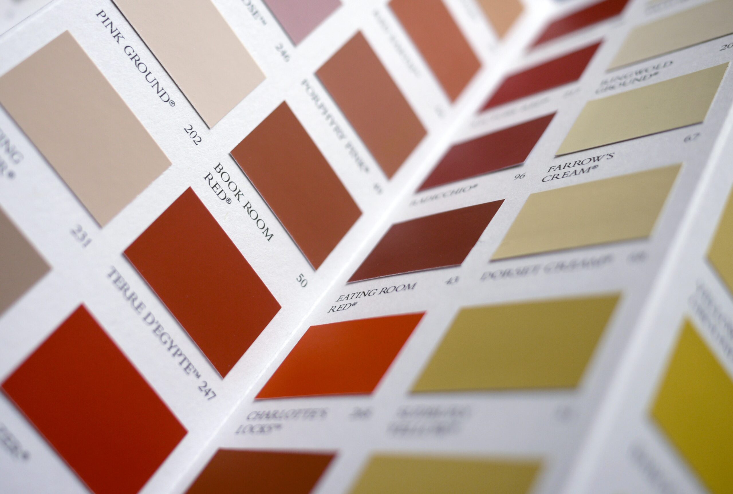
Expert Tips to Test Paint Colors the Smart Way
Before you commit to a gallon, take the time to see how your top choices truly look in your space.
- Buy Sample Cans: Test at least two to three shades per room.
- Paint Swatches on the Wall: Choose different spots that get varied light (corners, near windows, etc.).
- Observe in Natural and Artificial Light: Morning light versus evening lighting can drastically change a color’s appearance.
- Check with Your Decor: Place swatches next to furniture, rugs, and flooring to ensure harmony.
- Live with It: Observe how you feel about the color after a few days. Sometimes your favorite shade grows on you, or fades out.
Common Paint Color Mistakes to Avoid
Avoiding a few common pitfalls can save you time, money, and disappointment.
- Ignoring Undertones: Every paint color has a base tone—blue, green, yellow, and pink. Match undertones to your existing décor to prevent clashes.
- Skipping Surface Prep: A beautiful color won’t shine on a dirty or damaged wall. Proper cleaning and priming are essential.
- Choosing in Store Lighting: Hardware store lights don’t match your home lighting. Always test colors at home.
- Overlooking Finish: A high-sheen finish on an imperfect wall can highlight flaws. Match the finish to the function and surface.
Your Perfect Paint Starts with the Right Partner
The right color can elevate your home—and so can the right painting company. At That 1 Painter Greater Boston, we believe your walls should reflect your story. Our skilled team delivers precise applications, clean lines, and vibrant results that stand the test of time. From historic brownstones in Back Bay to new builds in Somerville, we’ve helped homeowners across Greater Boston bring their design dreams to life.
We don’t cut corners—we paint them! Whether you’re aiming for subtle sophistication or bold transformation, our team will guide you every step of the way, from color consultation to flawless finish.
Ready to transform your home with colors that feel just right? Let That 1 Painter Greater Boston help you find the perfect palette and bring your vision to life. Contact us today for a free consultation, and let’s paint something beautiful together!

